Item 1: Mock ups


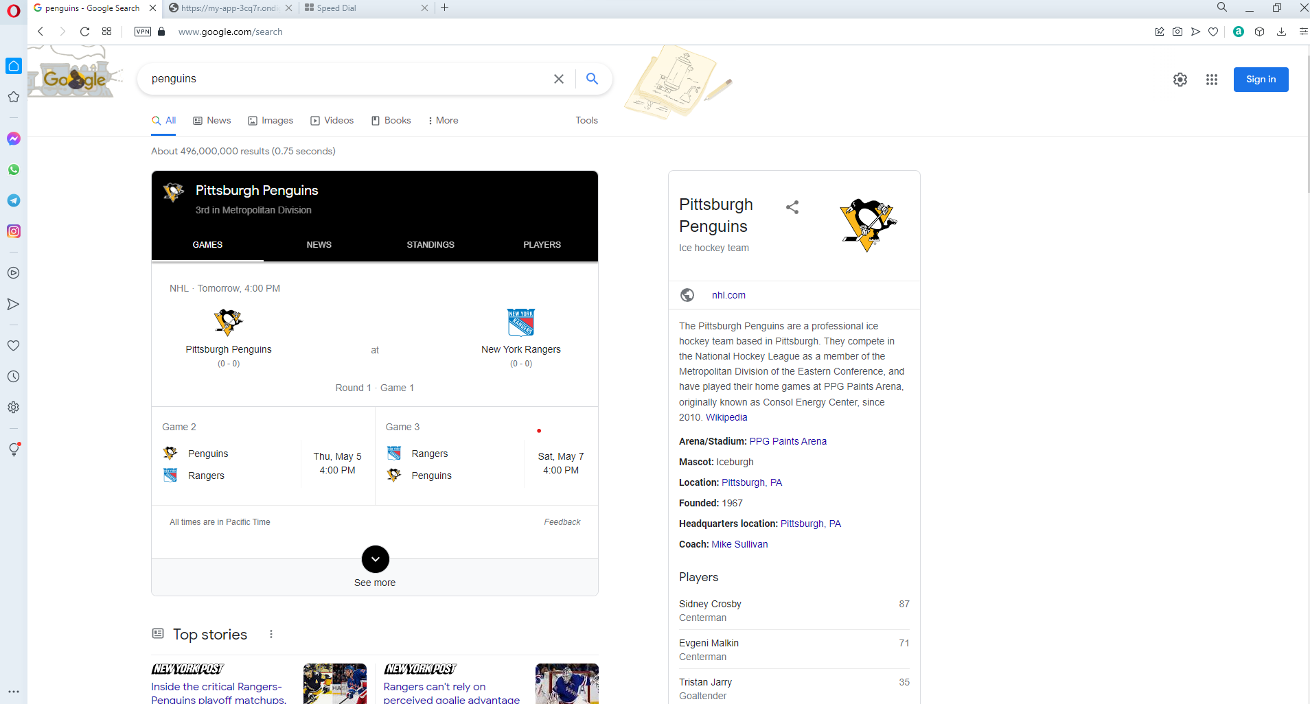
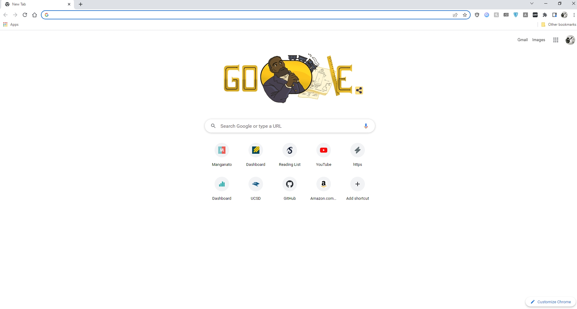
UI designs across different web browsers are now almost all uniform. They all have a search bar, tool bar, tabs bar, bookmark, and interface with a search engine. Users will have almost always the same experience across different browsers, nothing would be too unfamiliar or drastically different from the fundamentals.
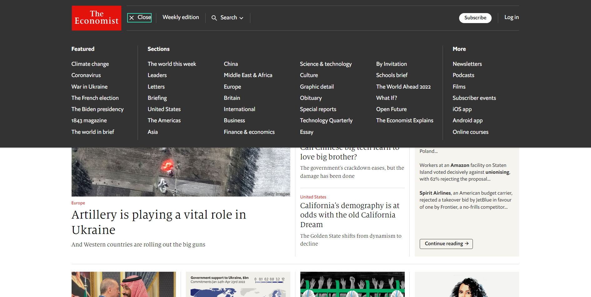
Drop down tabs when browsing news groups design by type. Users will not find Global News under Entertainment section, so this way Users can find needed materials at a glance. No need to browse the entire newspaper or website to find a single column. Just look by topic.

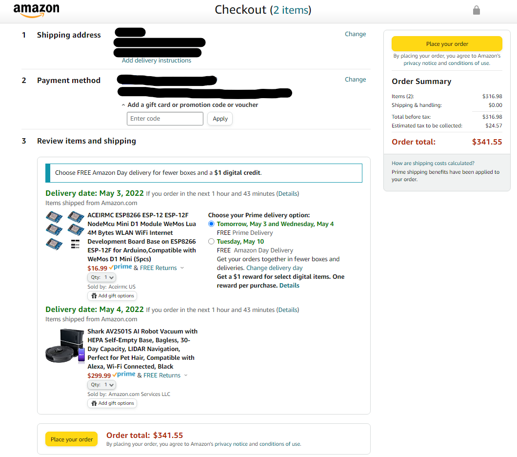
Although Amazon boasts of enabling Users to order through Alexa and automated orders, they still use confirmation pages during checkout. This is a necessary step and cannot be avoided because Users have to enter necessary information like credit card, delivery address, and item amount before actually ordering. This step allows users to confirm purchase and give liability if Users buy something they did not intend.
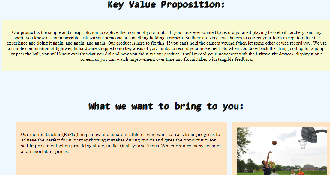
On first interaction with the product (RePlai), the user needs to know what are the necessary devices to get the product up and running. The necessary devices and knowledge include batteries, a computer or phone, WiFi coverage, and knowledge of social media. Users need to understand this product is not designed to give user responses on how to improve sports performance, it is a semi-social product that will inform users how well they mimicked a series of actions. RePlai also comes with a series of sensors to attach to a user’s body, so users must know how to attach them to key areas of movement with provided velcro and possibly straps for further security.
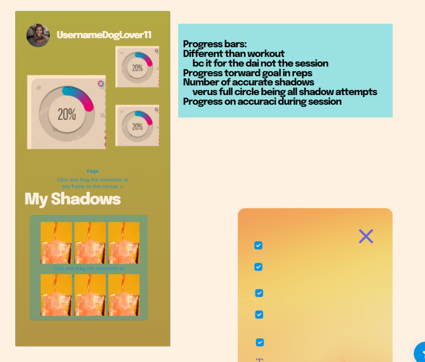
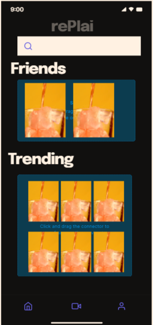
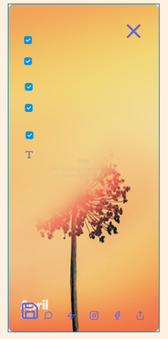
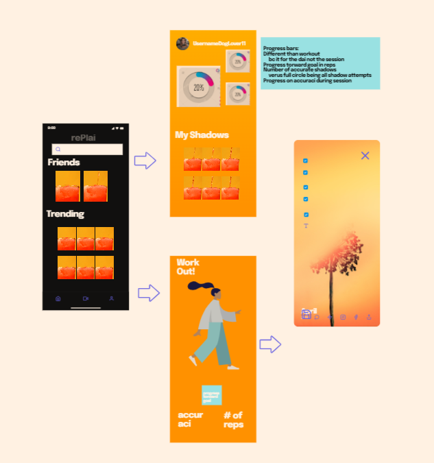
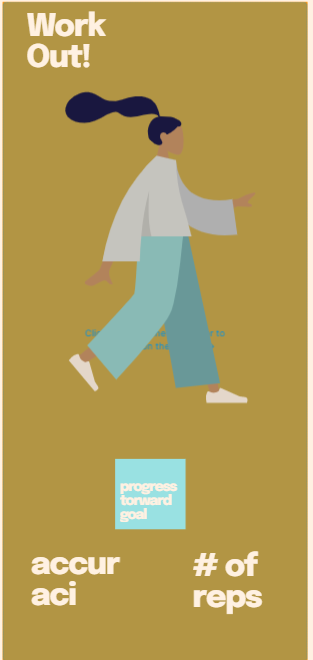
Principle of Disclosure, Principle of Exemplars, and Principle of Focused Navigation are the most important design principles for RePlai. The core of our product is a social media and sports app hybrid. So we take the design principles already used in both markets into our app like activity timers, motion tracking, friends and social interactions, etc. RePlai relies on numerous incoming data points from body sensors, much of the information is masked as a 3D display but we can display all the raw sensor data if the user desires. In our application, we sectioned the display into three general tab categories: Home, Record, and Profile. This clear division between tabs allows users to focus on what they want to use and see at that moment in time. The flow does not interrupt user navigation to other parts of the app because the intention is to have clear divides on what the user should be focused on.
RePlai makes the most sense with a mixture of Sequential and Chronological logical principles. Our application has a lengthy procedure at set up and requires users to jump through a few hoops to get to their desired outcome. It will walk through users the complexity and simple navigation of displays inherent to some social media platforms. It should also be organized chronologically because we are recording small “videos” and recommending “templates” at the same time. RePlai will thrive in a situation where it refreshes based on the most recent and popular “templates”.

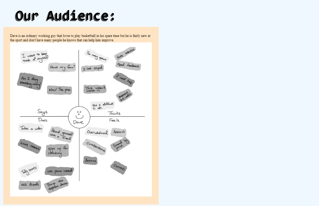
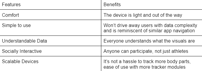
Our MVP design stresses the ease of visual interpretation of data and simple app navigation as our useability-driven design. The visual interpretation is achieved through a series of overlay-able skeleton gifs that can compare visual performance from one instance/attempt to another. It would look like several skeletons moving together at the same time and a sidebar that can selectively choose which skeleton to show at the same moment. Of course, gifs will be played at a loop. Then the simple social app navigation. This allows users to not only use the app for personal competition it can also be used as a social platform. The users can invite friends and families to have friendly mimic competitions instead of a super-serious data driving form correcting app. It lends itself to reusability because there is something to go back for, not just self-improvement. This allows for personas beyond athletes and health nuts like Jane the basketball fan to pick up and revisit the app to connect with similar-minded personas. The key point is to give a reason for users to come back to the app besides using the skeleton function, recent surveys have shown that users typically uninstall or do not use an app after a 24-hour period unless the app is extremely engaging or fulfills its job with minimum hassle. If you want to read more about digital health apps and retention rates, click on the hyperlink below for a redirect to an article from The Economist!
The Economist: Apps interpreting data from wearable devices are helping people to live betterWe estimate total cost of material labor and manufacturing will be around $25 dollars for the hardware. We deduced that number from the follwing data:
According to Candorind , the normal cost of PCB Assembly is between $10- $50, dependent on size, components, finish, and a variety of factors.
We built our prototype with the cost of an Arduino Mini($12), ultrasonic sensor($4), Accelerometers($2), Multiplexer($7). Together the basic components costs at minimum $25 dollars, not including tax, shipping, and components.
To account for additional costs, and then also the reduction for volume of scale, the rough estimate cost to produce hardware is $35.
Accoring to imaginovation.net,
The cost to maintain our website will be between $400 to $1000 for the first year.
Separetly, the cost for app store development is $25 dollars at google and $99 dollars through apple, including server fees between $240 to $720 dollars per year
The sum total of cloud maintenance, is estimated $525- $1825, cost of labor and scaling is not included.
Our app will have a 1 time fee for the hardware product and then a freemium feature for the app/website. The user can the free version or monthly/annual subscription.
Optimalistically, we expect to have 1,000 paying customers with 10,000 users within the first year.
The app/website's annual subscription will be $49.99 and $9 for monthly subscribers. Access to premium features will be available upon payment until the next billing cycle (annual/monthly).
We calculated the subscription fee from Forbes's How Much are users really willing to pay for subscription mobile apps.
The average monthly fee between $7-$20 gets 5x as many sales as those in the $20-50 category per month and 6x as many as $1-$7 per month. Thus $9 a month was the optimal choice.
Our competitors in the fitness industry like 'myfitness pal' or 'simple' set their subscription to a yearly membership of $49.99. To stay competitive, we priced our
annual subscription the same amount and offset by $9/month as more costly (so the annual value would be a discount), at around 44% discount to do an annual
membership. The cost we will sell the hardware will be $39.99. This is a markup of 14% from our estimated manufacturing($35).
According to Electronicink, a good profit margin for small business product is between 7-10% with a good baseline of subtracting 5% from expected profit
due to unforeseen circumstances. Thus we should be in the range of 12-15% markup from the estimated cost of hardware.
In Summary for Consumers:
annual subscription: $49.99
monthly subscription: $9.99
cost of hardware: $49.99
Our initial thought of MVP was supposed to be a simple strap-on device that can track user limbs for giving feedback on basketball free throws based user’s form. However, we realized later that the product would be only for professional basketball players and extreme enthusiasts and raised the question of how are we supposed to measure “good form”. The problem was two folds, those that could use the device have far better alternatives and the “good form” is different for everyone. Generally, “good form” in whatever form works for the individual, so we could not give person A’s method of shooting to person B because person B has different physiology and habit than person A. So we pivoted, instead of just giving data feedback to users, we went toward visual feedback of a modeled stickman to keep it simple and work the system into a social media type environment. The purpose is to expand our addressable market beyond just basketball players and to sports types that wish to record and share their body movements. This was a customer need-based pivot because it was clear to us that our customers would not be satisfied with just another sports tracker, it had to provide general feedback to users beyond just sports. Hence, our pivot to a more social and visually simple MVP.